All About Those Tooltips
- Dawn Harrington
- Apr 13, 2022
- 3 min read
Are you a beginner user and you want to put some pizzaz in your Tooltip? Do you want to make it more exciting than just the plain ol' default text : text?
Here are some tips and tricks about Tooltips.
Get Rid of the Default Format
Does your Tooltip look like this? Tableau will put all of your metrics on a worksheet in the Tooltip. It is important that you pay attention to this so you don't get visual noise like this;

Go to your Tooltip marks card to edit it.
In my example below I am editing the Sales Marks card from the "So Your Client Wants a Table" Training dashboard here. (The star dashboard has changes to the Tooltip, the circle dashboard does not.)
Here is the default Tooltip on the Sales column:

It is a great practice to restructure the text in this field to be a sentence. You can start typing before the <Sub-Category> field. Any fields in-between these <> arrows are the metrics on this marks card.
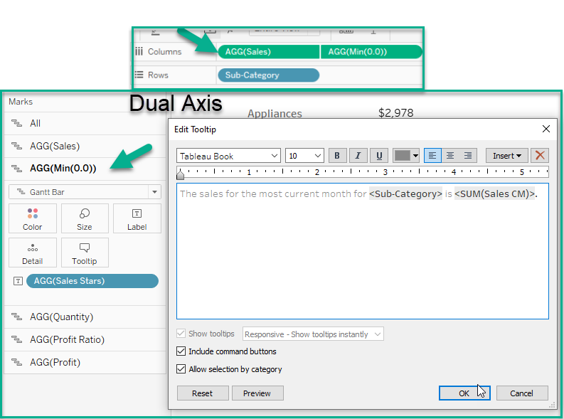
I changed the text in this Tooltip to appear as below;

All of the font adjustments are at the top of your Tooltip field next to the Alignment and Insert icons. I like to make my fields a bold darker text and the rest of the text a lighter gray. This makes the text visually pop!
If you accidently delete all the text in your Tooltip to make your changes, don't worry! You can insert these values from the Insert drop-down next to the alignment buttons on the Edit Tooltip pop-up menu.

A sentence looks much better in a Tooltip than those default values.

If you have a Dual Axis, such as I do for the stars values, you can copy and paste the text from one Tooltip to another.

Get Rid of the Include Command Buttons and Allow Selection by Category
As I have mentioned in my other blog posts. I like to remove the Keep Only and Exclude functionality from my dashboards.

If your client doesn't know a lot about how Tableau works, they can click on Keep Only and not know how to remove the filter.
Here's a picture of the dashboard with Keep Only selected;

In my opinion, this feature is not worth keeping.
Simply go to your Tooltip and uncheck both of these boxes to remove this feature.

If you have multiple pills on your columns shelf; its faster to go to the All Marks card and uncheck these boxes, instead of opening each Tooltip on every Marks card.
Insert a Sheet to Make It Interesting
Did you know you can insert another sheet in your Tooltip? The downside is that your user can't print it out, but on the upside it helps to keep your user engaged.
If you go to the Insert drop-down on the Tooltip pop-up menu and select the Sheets arrow, you can see the other sheets in your workbook. You will need to pick the right worksheet to compliment and work with your chart.

I clicked on Sales by State worksheet. This is how it appears in the Tooltip field;

Notice the max width and height are 300 pixels. You may need to adjust this, if the text says the image is cropped when you hover over a metric in your worksheet. I adjusted the width to 500 below;

One thing to note, the sheet you are pulling in must have the metric you are using on the Detail Marks card or it will not display correctly.
In the example below you can see lots of lines in the bar charts. The worksheet I brought in does not have the Sub-Category metric in it.

Here is what happens when I add Sub-Category to the Detail Marks card of the Sales by State worksheet;

I can still see lines in my bar chart on my Tooltip. Adding this metric didn't change anything.
Next, I try adding a filter to the worksheet in the Tooltip to see if it makes any significant changes, it does not.

The bar chart is still displaying those extra light gray lines. This worksheet will not work with this chart in the Tooltip.

A better worksheet to pick is one titled Bar Chart Sales Sub-Category. It has the Sub-Category on the Detail Marks card and does not have the State metric in it.

Look what happens when I perform a sheet name change in my original Tooltip.

Now the light gray lines are gone!

Feel free to see the comparison in this tableau public dashboard.
Comments