Before and After Dashboards
- Dawn Harrington
- Oct 25, 2023
- 2 min read
Updated: Oct 26, 2023
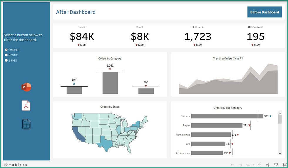
In the below blog, I review multiple tips and tricks on enhancing dashboards. I created a tableau public dashboard here that shows you a before and after revised dashboard using these tips.
Before Dashboard

After Dashboard

You can click on the navigation button in the upper right-hand corner of both dashboards to go back and forth.
In the After dashboard, I kept with the best practice of providing two dashboards; one for a high level overview of your metrics and then a second for drilling down into the data. The second is assuming your users want to download the data to an Excel workbook. Click on the spreadsheet icon to navigate to the second view.
Here are methods I used to enhance the After dashboard;
Use a Parameter to swap measures - I used parameters to swap the dashboard for Sales, Quantity and Profit.
Remove Map layers - I simplified the map by removing map layers. This reduces the amount of visual noise you have in the background. Do you need to display country names and state names?
Remove Labels on maps - Labels can overlap each other on different states / countries. It is not a good practice to display these on a map. Customize your Tooltip for labels instead! You can also annotate a mark if you are calling it out.
Use Dynamic, Year over Year (YoY) and Month over Month (MoM) calculations - your clients may want to see how this month performed compared to the prior month. Or how did this year perform compared to the prior year? There are a whole bunch of calculations to obtain this here > Link
Use Reference Lines with your MoM calculations - A reference line is a great way to see how a bar for this month's values compare to the previous month's.
Create Positive and Negative arrow calculations - You can use the windows character map application to pull arrows into your calculated fields. You can compare your current month calculation to your prior month calculation to identify increases or decreases.
Use BANS or KPI's at the top of your dashboard - I used the min(0) calculation method to create additional marks cards for the BANs in this dashboard.
Placement is key- that sweet spot is at the upper left hand corner of your dashboard. Don't waste this space with a visualization that is not as important as another.
Clean up your Tooltips! - whenever possible change your tooltip from the default. Include vizzes! Here is a link to an older blog article for enhancing these.
Review the size - are your bars too large? Shapes too small or too big? Size matters!
Be consistent with Labels - If titles are uppercase, make sure they are all uppercase.
Use Padding - Make sure you use inner padding and outer padding in a dashboard! This is often overlooked by beginner users.
Remember to Sort - after all of the tips I list above, I sometimes forget to go back and sort. It's better to see Bar charts with the highest value at the top and the lowest at the bottom.

Opmerkingen